Support Forums for LiveMesh Themes & Plugins › Forums › Extinct Theme Support › Header spacing and layout problems
Tagged: spacing header layout
- This topic has 7 replies, 3 voices, and was last updated 7 years, 12 months ago by
gregeva.
-
AuthorPosts
-
January 26, 2016 at 3:09 pm #18866
gregeva
MemberHi meteorite,
I have been waiting for a response from you on some of the outstanding issues, only to find that I had grouped multiple header related issues into one thread and you addressed only one of the issues. I am no longer able to add new posts to this thread…
http://support.livemeshthemes.com/forums/topic/header-spacing-layout-and-wrapping-problems/
So if you would please respond to the issues relating to their being no space between the header and content areas and that the header content (text title, site description, and mobile menu) overflow into the content area.
I need to get this resolved as the client is looking to get together and get the site finished.
Regards,
Greg
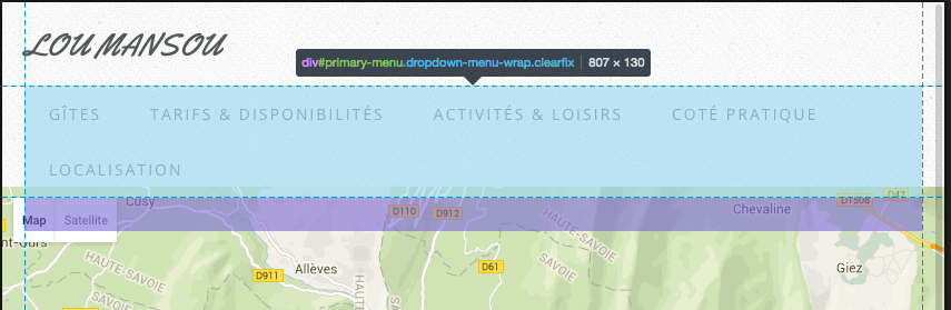
January 26, 2016 at 3:11 pm #18867MemberThis image shows clearly the overlap that I am talking about; and this obviously won’t just affect the menu wrapping.
 January 27, 2016 at 7:03 am #18884
Veena
ModeratorCan you pls try the following custom CSS –
#primary-menu {
    margin-bottom: 30px;
}
 #mobile-menu {
  padding-bottom: 30px;
}
@media only screen and (max-width: 767px){
#site-logo {
    top: 0;
}
#site-description {
    top: 0;
     margin-bottom: 15px;
}}
March 1, 2016 at 11:40 am #19733MemberThe Custom CSS changes that you have been suggesting in the various threads are starting to overwrite each other, however I have made your suggested changes to see if they would fix the issues.
Despite adding a bunch of padding/whitespace, the inconsistent spacing and overlap occurring from the header into the content area still exists. Simply adding a bunch of padding to try to make the issue less visible is not an acceptable solution for the professional work that I do.
I am including two screen shots which show the primary menus box model and its positioning on a couple of pages on the site. These show that the issue is not with the menu, but the layout and overlap between the header and content areas.
I would greatly appreciate it if you would address the base layout issue so that all pages and posts and browser resolutions will simply have consistent and clear behavior regarding the cutoff between the two zones. CSS media rules should not be required to accomplish basic DOM layout and spacing.
March 2, 2016 at 1:38 pm #19759ModeratorPls add the below custom CSS in themeoptions –
#primary-menu {
    top: 0;
    margin-top: 30px;
    margin-bottom: 0;
}
March 17, 2016 at 11:43 am #20039MemberI am trying to be very patient and understanding here, but I don’t get the understanding that you are even reading my posts.
Fiddling with the menus margins and padding a bit bigger or smaller or higher or lower is not going to have any effect on the fact that there are clearly issues between the header and content elements which is a deeper underlying issue likely causing the menu layout inconsistencies.
I did however try your suggestion, and despite adding a lot of unwanted whitespace, it seems to look reasonably acceptable on a computer screen. However now when I view the site on tablet portrait size, there is an unwanted dark bar traversing the screen between the header and content (about 10-15px high). This is an example of what I have been mentioning; without fixing the underlying issue, others will arise as band-aids are piled on overtop.
Having to test and come up with many different hacks in order to get it to display correctly across various devices and screen sizes is simply unacceptable for a supposedly RESPONSIVE theme.
I would like to give you another chance to take this more seriously and propose a suitable solution which will work throughout the life-cycle of the web site as well as your themes updates.
March 18, 2016 at 12:11 pm #20051Raghavendra
ModeratorFirst – you must reduce your menu items or reduce text for the existing menu items. I changed the menu item ‘Tarifs & Disponibilités’ to ‘Tarifs’ for my testing. There simply isn’t room for the all the menu items with their lengthy text you have for each item.
Pls use the following custom CSS –
#site-description {
    position: absolute;
    top: 70px;
}
@media only screen and (max-width: 767px) {
#site-description {
    position: relative;
    top: 0;
}
}
#primary-menu > ul.menu > li > a {
    padding: 0 15px;
}
If the above does not work for you, pls show me how we can solve this problem if you believe there should be a better solution than the above. You can seek a refund for the theme if you still think you can find another theme/author that can display perfect in all devices with all the existing menu items. Sorry we have done our best and there is nothing we can do more.
Only other option is to activate mobile menu for tablet resolutions instead of displaying the regular menu.
April 22, 2016 at 11:23 am #20916MemberThank you for your offer to provide a refund for the theme purchase; however the project is too far along to start over with a different theme.
As for your idea for me to tell you what to fix; I was expecting that from your team as the theme provider.
I have already spent a significant amount of time and energy collaborating with your team in an effort to seek resolution. As this has not been successful, I will focus my efforts on fixing it myself.
-
AuthorPosts
- The forum ‘Extinct Theme Support’ is closed to new topics and replies.